ROADSIDE SHORTHAND: THE PERFECT BUS SHELTER DESIGN
It’s no secret that billboards present a challenge of keeping the message (artwork) simple yet impactful, let alone engaging, and sometimes, even entertaining and educational. But unlike many of their advertising counterparts, billboards give the audience only 6-10 seconds or less to look at an ad. Of course, some billboard panels play exception to the rule, e.g., are seen by walking traffic or at a traffic light.
Enter the bus shelter, a 4 x 8’ mini billboard. 6 seconds is typically the longest read-time one of these affordable panels can offer. Consider this against an audience being constantly bombarded with advertisements flaunting promises, many of which are lies, and as a result, American consumers have become cynical and jaded. We, alongside our advertising partners, are truly fighting an uphill battle on several fronts. Brevity and attraction more essential than ever.
Like their bigger billboard cousins, bus shelter ads must also be believable and compelling; but the biggest difference is – you guessed it – heightened focus on ultra-simplicity and readability. That’s why, when building our bus shelter design, we include only absolutely essential information, with every piece geared towards accomplishing the client’s specific advertising goal. If the message can survive without it, leave it out.
Start with the business name/logo. As small, permanently placed boards, our shelters are tailored for long-term branding & awareness, so the name’s often the star of this show. There’s really only room for one other strong piece of info to accompany – a directional, a product/service or maybe even just a road/town name if people don’t know where you are yet. It’s ideal to include a unique selling proposition if your business has one, but only if it’s relevant, believable, and can be quickly communicated. Do people need to know something specific to move closer to a buying decision with your business? Or is name recognition/trust building enough?
Let your billboard be the first step to a deeper exploration of your brand: don’t try to make it do all the heavy lifting. To the disbelief of many advertisers, putting a call-to-action on your mini- billboard is rarely advisable at best, and most times, just unnecessary. Phone numbers, websites, and locations have all become easily searchable and accessible our digital age.
In the billboard biz, great creative shows instead of tells. Check out these examples of smart bus shelter creative strategies!
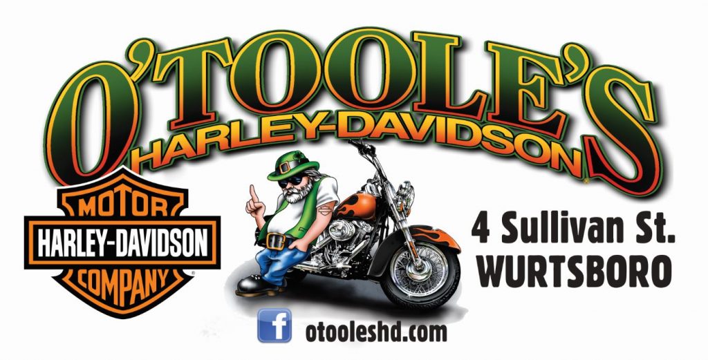
Top of the mind awareness & branding, straight-up.
I get excited to talk to a client who is “just looking to put their name out there” as many say. Why? Because there is literally no more affordable way to keep your name in front of locals. Our shelters are ready-made for this! Want to get more aggressive? Pepper your name all over the place with a larger (still affordable) bus shelter package! O’Toole’s lets their super cool logo do the talking – who’s cooler than an Irish biker?
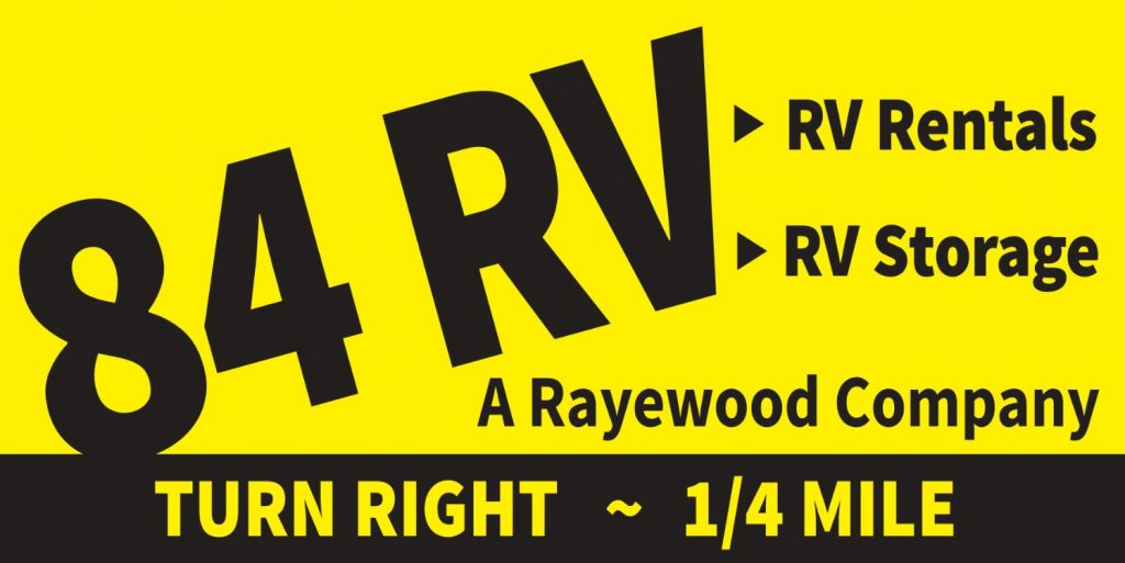
Product/service association.
When you think 84 RV, we want you to think RV rentals & storage. This name-product association strategy has proven effective for long-term or “big” buying decisions. And while you probably won’t change your schedule to make an impromptu stop at the RV store, a directional sign is never a bad idea, unless you’re one of those rare businesses who doesn’t want to drive foot traffic.


Directional.
On the other hand, if you’re hungry or thirsty behind the wheel, you may want to swing into Mickey D’s with the help of a trusty sign to point you in the right direction! Fellow Kegerreis blogger Eric Murr puts it simply: “Everyone eats 3 times a day, and everyone drives or rides in a car”. This audience-message alignment, along with immediate logo recognition and a directionally relevant location, make bus shelters and fast food restaurants a perfect match.

Unique selling proposition (USP).
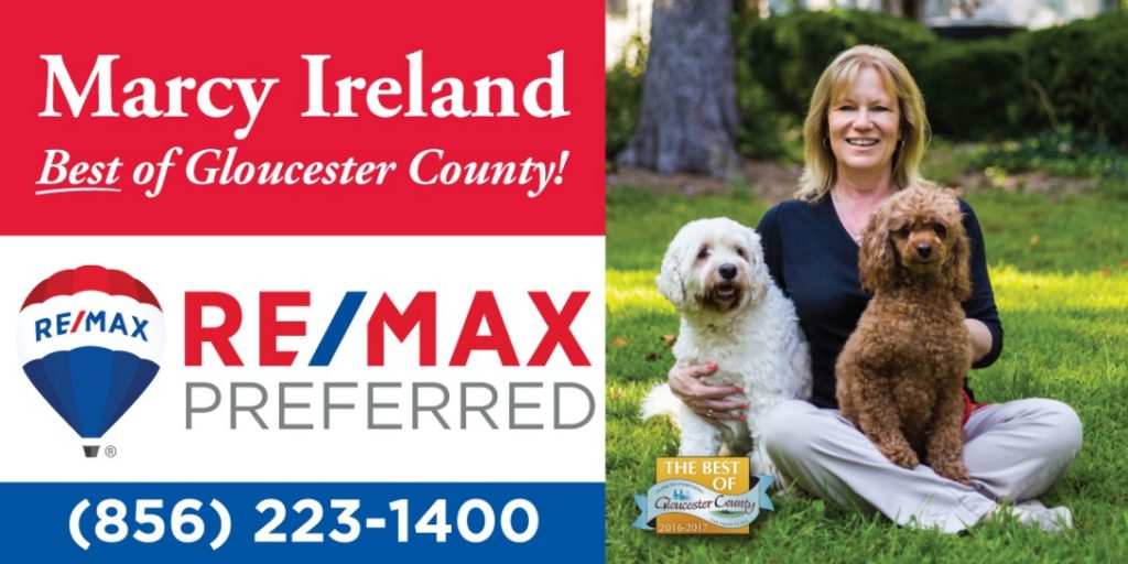
In this design, realtor Marcy Ireland IS her own unique selling proposition! Choosing one’s realtor is normally based on existing connections or relationships, rather than company loyalty. Most of our real estate advertisers (plus insurance agents and financial advisors) use a professional photo on their bus shelter billboard, which helps strike up conversations and build long-term trust and awareness. This strategy works well for any business where trust is a big buying factor. Marcy’s shelter has helped her become known as a friendly, experienced, personable agent who loves her pups!
